GO ON, ADMIT IT. SPOT COLOUR
GRADATIONS ARE A NIGHTMARE TO PROOF.
We can put a man on the moon (allegedly), so why is it, spot colour gradations always seem to look awful on a proof?
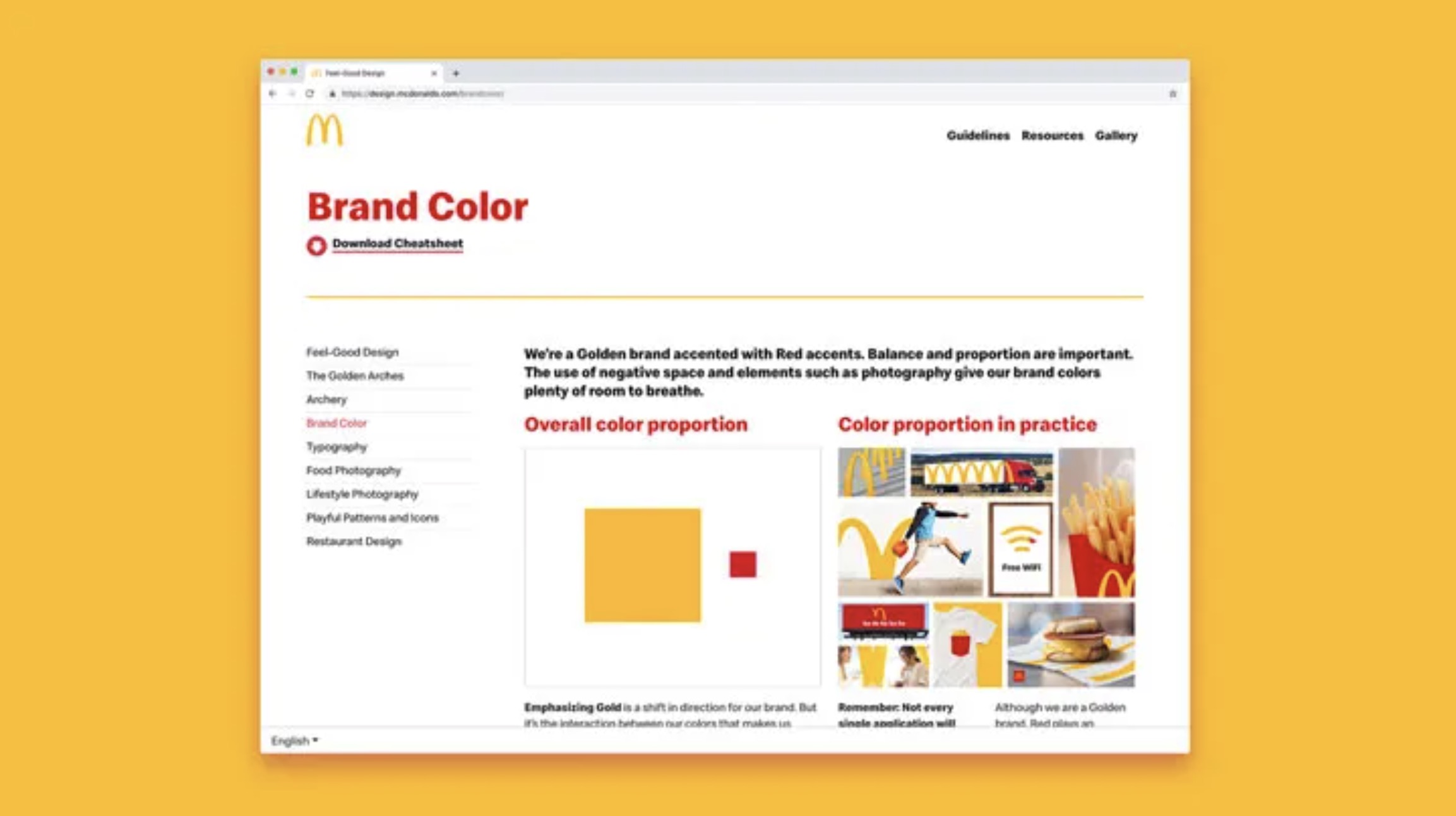
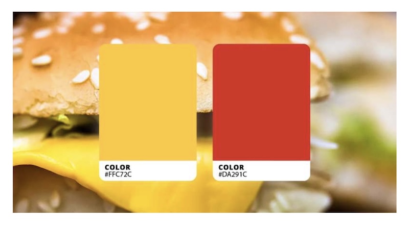
Think about McDonalds. That pure, punchy red – PMS 2035 C – is in everything from warning labels to Double Bacon BigMac with Cheese. It’s consistent. It’s solid. And it’s pre-mixed to a standard for all-important reasons like brand integrity, confidence, blah blah blah. You’re a serious printer, so you know all this.
Spot colours on their own are easy. But the trouble starts when a new designer joins the team. And all of a sudden, Mackie D’s wants to fade that red, softly, into a band of white, run off a few Happy Meal boxes that take PMS 2035 C, smoothly, into PMS Coated 1235 C – yellow. That means grading one spot to another on a proof.
This is where it gets interesting.
The good news is, it’s probably not
your fault, THAT MERLOT LOOKS LIKE PORt.
There’s no point blaming the designers. Some of them are straight out of colleges that haven’t explained, spot colours aren’t built from CMYK combinations. They’re mixed up separately ~ as, you, know.
Give them their due, great design isn’t confined to block colours. It’s a medium that demands flexibility — soft fades, little bits of shadowing, and endless vignettes, oh heavens, the vignettes — but that’s where gradations get out of hand. The touch of a mouse, a flick of the wrist, and you’ve got jalapeño rainbows everywhere.
Sure, they might be following brand guidelines to the letter, but that doesn’t make them geniuses. Most designers work on-screen. It never occurs to them, “How’s this going to look on 17 different substrates?” Oh no. It’s your job to make that happen.
In Illustrator or InDesign, they’ll apply a percentage to one spot — fade it from 100% to 0% to create a screened gradient – and then lay a second one on top. Hey presto, that’s PMS Coated 1235 C melting gently into the ketchup, or that’s the theory.
But when those designs hit your proofer, that’s when it all goes wrong. . .

WHAT HAPPENS WHEN YOU PROOF SPOT COLOURS?
You know, your Epson can’t blend spot colours like they’re CMYK. Gradation depends on control, and control depends on the type of press you’re using (digital, offset, screen, flexo), the substrate (coated vs uncoated, paper vs film), and the line screen (how fine your halftone dots are). Too many things to go wrong.
On coarse uncoated stock for example, that cheese flop with a 5% tint at the edges may blot up like bruised cheddar. And yet on a high-gloss coated sheet, the same wedge of melted deliciousness may look spot on, pun intended.
This is where spectral colour references come in.
By default, proofing RIPs use a colour reference that’s grounded in LAB data. That’s great for 100% solid colour, but it’s not good news for anything less – like tints of 10%, 20%, 30%. However, spectral maths helps your proofer to reproduce those tint-ramps and gradations very, very accurately – it’s all about the spectral maths, pouring the right kind of fuel into your colour engine.
Still, you’d be surprised (or maybe not?) how many firms still try to proof spot gradations on an inferior system, and then send them off to a customer. Most proofing RIPs simply can’t handle it. That said, If a RIP can interpret the mathematical spec of a spot colour precisely, through analysis, then it can also recreate it accurately, with good ol’ CMYK.
Each proofer handles spot colours differently, and everyone’s got their workaround. Sure, there are ways to make gradients look a BIT smoother, but it’s not true to file and a good brand manager will spot it, a mile off. That’s the guy who pays your bills.
So what’s the solution?

DON’T LOSE YOUR PICKLE
Sure, you could try getting round the problem by converting spots to process colours. But then what was the point in anyone spending millions on the brand?
The reality is, designers will carry on inventing a thousand new ways to ruin your Friday afternoon proofs. Luckily, there’s an answer to the problem – all you need is a proofing RIP that’s engineered for spectral colour. SImple.
Talk to us about CGS software.
Better still, send our team a file with your worst proofing nightmare – spot colour gradations, nasty as you like – and we’ll send you the hard proof.
